
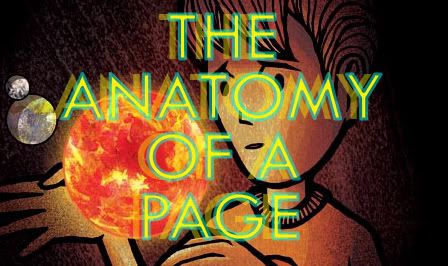
Hi, it's Kevin, the author/illustrator of the Earth Machine. I got some questions about how I go about creating illustrations for the Earth Machine, so I decided to put this little presentation together for everyone to see. I love learning new things, so I'd encourage everyone to post blogs about tips, techniques, or great products to try.
I primarily work on the computer, using Adobe Photoshop and Illustrator software to color my drawings. Occasionally, I use watercolor paintings or photography in tandem with the computer.

Every page begins with a pencil drawing. I never start on the computer b/c I believe in hand drawing. Things I don't draw are rigid straightlines, like borders or architecture. For those lines, I use Adobe Illustrator.
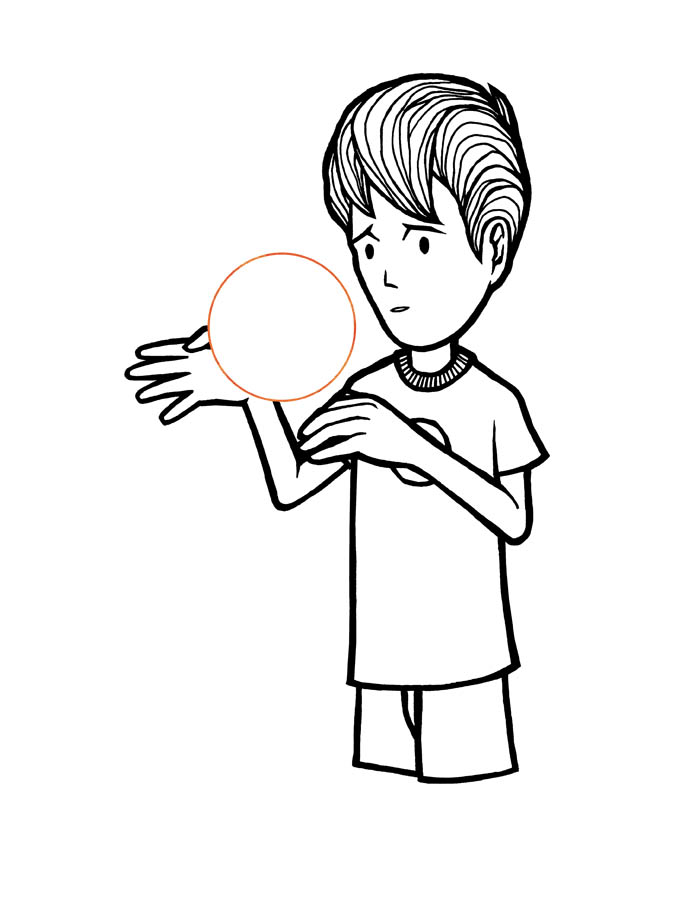
After penciling, I hand ink the pages with various pens (pigment liners, quill, brush). I do this because I like the look of hand inking. By using hand inked lines with artificial Adobe Illustrator lines for buildings, I can create a contrast between the characters and their environment. When coloring in Photoshop, I use anywhere from three to eight layers.After scanning this into my computer and cleaning it up, this becomes the top layer- notice that the black lines float on top of all the colors on the pages.

Although the Earth Machine looks really colorful and blended with gradients, each page actually begins with only a few colors and I lay them down as flat colors (mostly). I do this to establish a general palette for each page. These base colors dictate all the other colors on the other layers. This flat color layer stays below the ink layer.

To create the color variations, I create a texture layer. This layer is above the flat color layer, but beneath the ink layer. I adjust this layer as an opaque transparency, so the the flats can show through, but you can still see the texture at the same time. This layer is where I include paintings, photos, and gradient coloring on Photoshop. A texture that every page has is a paper texture that I scanned and overlayed. By using the same texture on all pages, it gives the pages a sense of unity, despite having different color palettes.
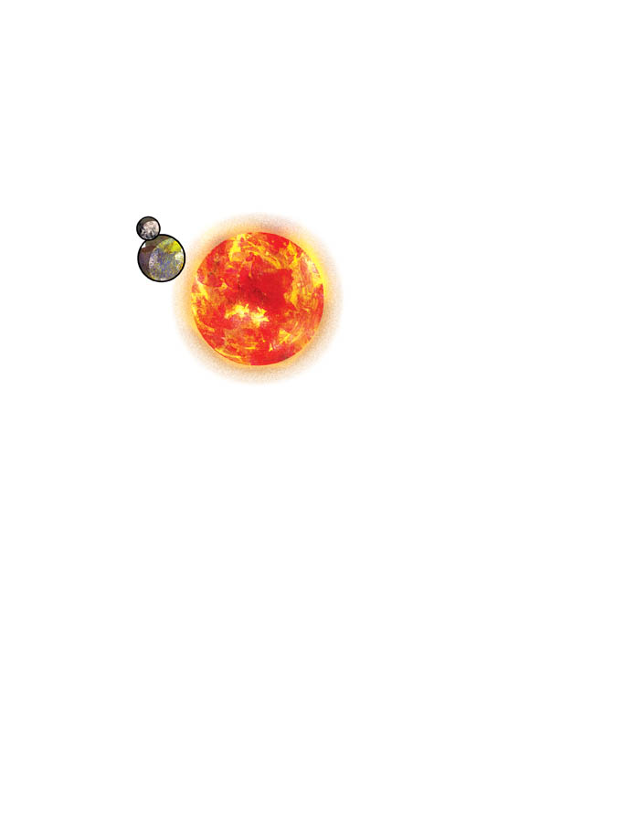
These are separate paintings in watercolor of the planets. These go on top of all layers because the sun is the only light source, so no other part of this illustration should overlap it.
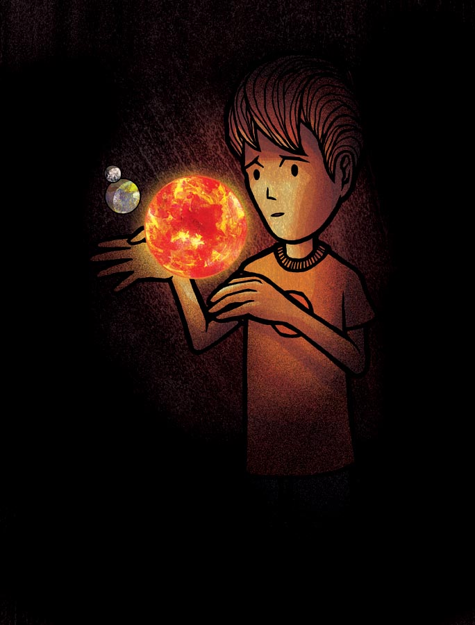
After all is said and done, we get a finished result! Feel free to email me any Photoshop or Illustrator questions or send me tips and suggestions of your own.
posted by Ami Blackford at 11:47 PM
![]()

5 Comments:
Hey Kevin, this is a really impressive presentation—very newfangled and futuristic! You’re going to have to tell me how you set it all up, the moving pictures I mean. The only kind of video I know how to post is that clunky YouTube box, and even then the quality is pretty lousy. Also, that paper texture you’re using, what kind of paper stock is it exactly? Is it just watercolor paper?
i love this post! it really shows your process Kevin - well done. You have a nice blend of traditon and technology. What kind of ink do you use for your line work?
Ami B.
Fantastic! kinda freaked me out the pages where moving lol
Kevin. You are making the rest of us look bad! Again, great work.
oh my gosh - a texture layer; BRILLIANT!! haha, I've never done that with a piece of digital art but now I really want to try it out! It added so much to your page, seriously awesome! Thanks for that :D
Post a Comment
<< Home